Norwegian University with an international focus
Client
Nord University
Deliverables
- Brand Strategy
- Naming
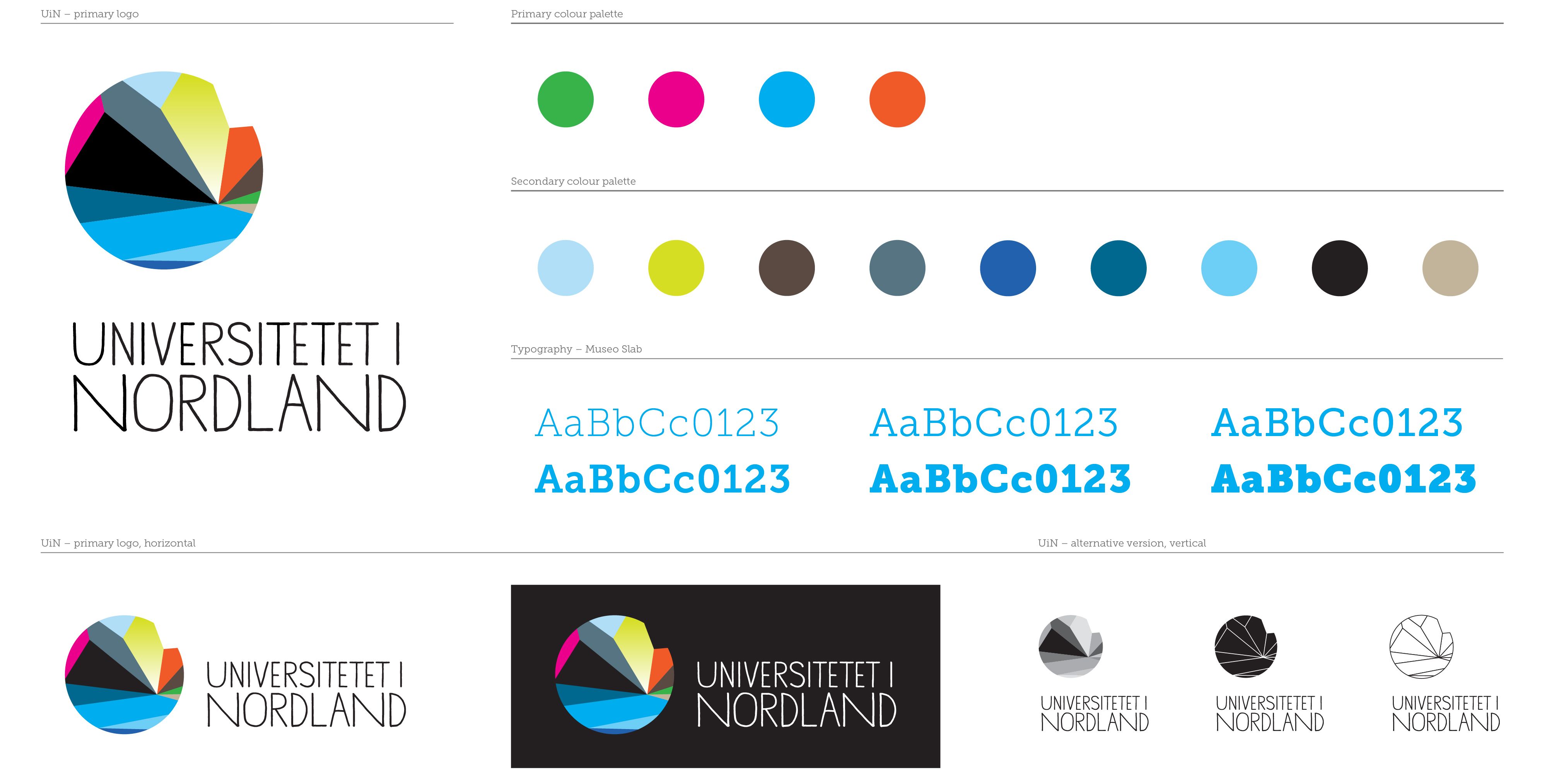
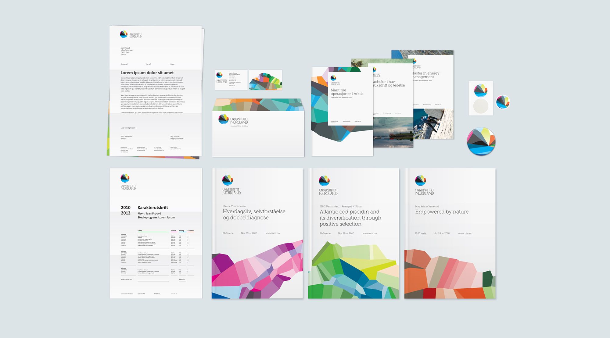
- Visual Identity
- Digital
- Editorial Design
- Illustrations
- Info Graphics
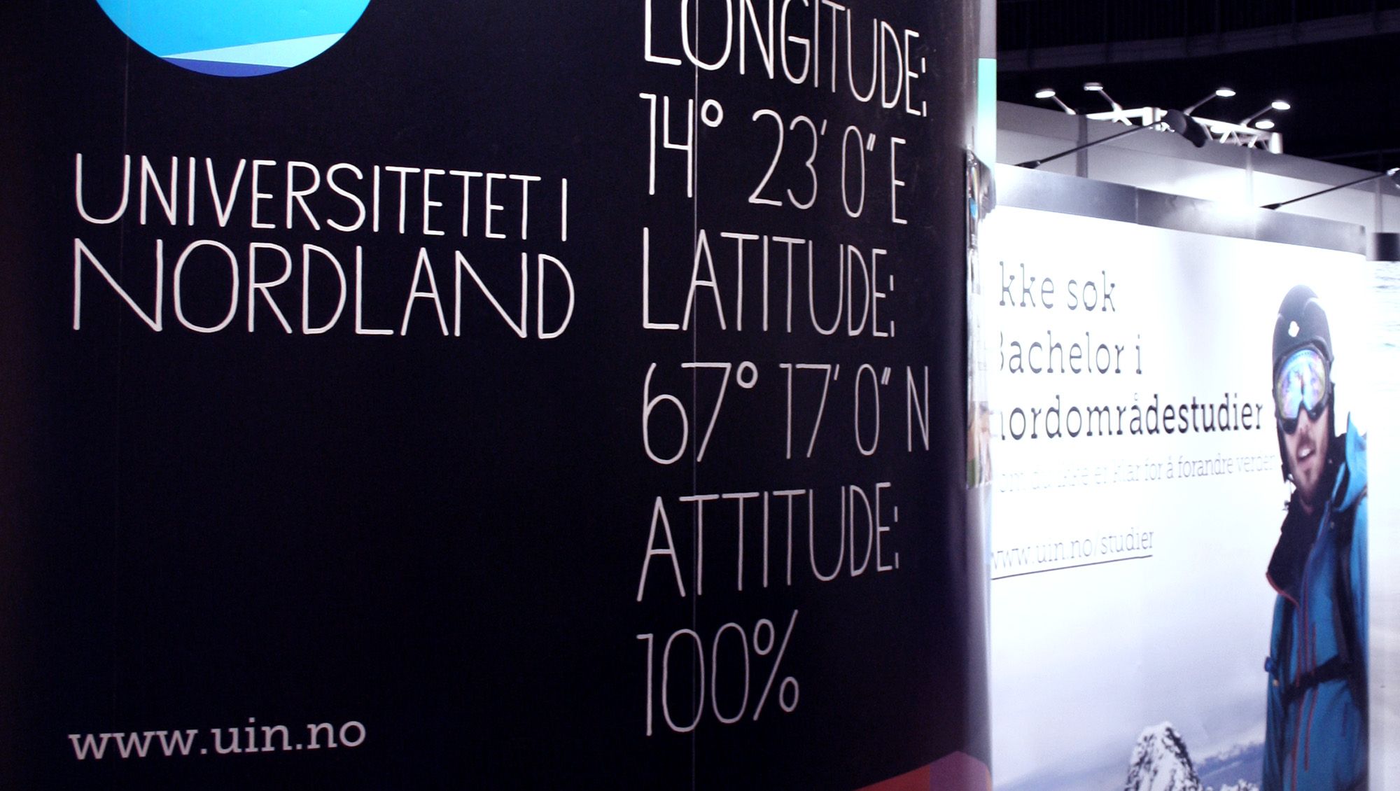
- Exhibitions
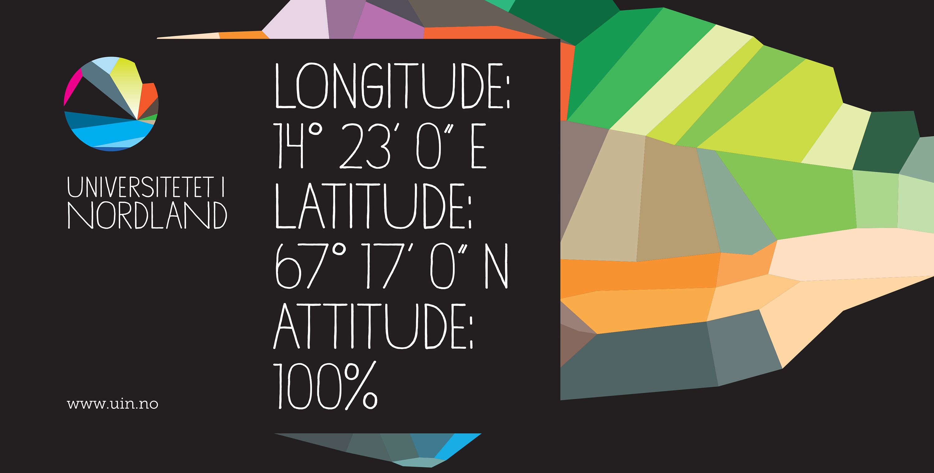
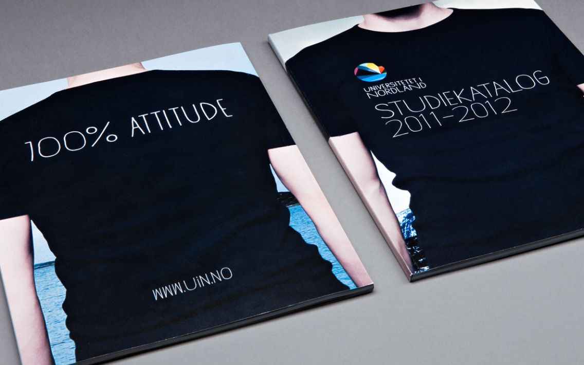
UiN, Nord University, is quite unique when it comes to its location, fields of study and not least by being a Norwegian university with an international focus.
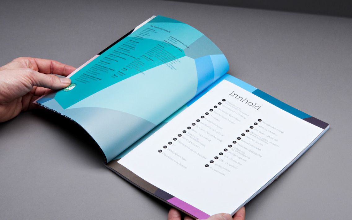
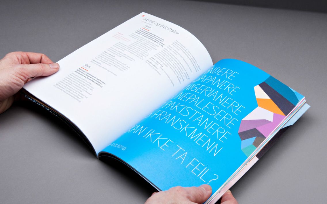
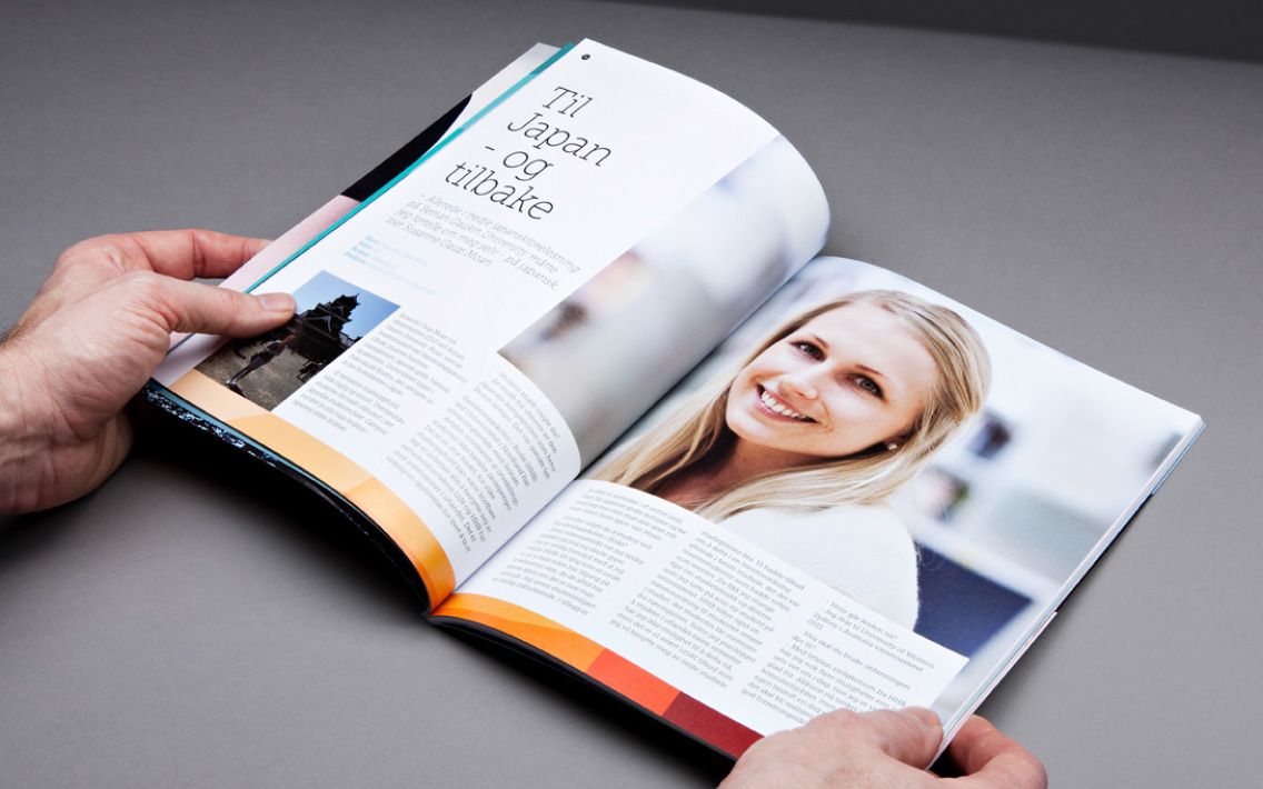
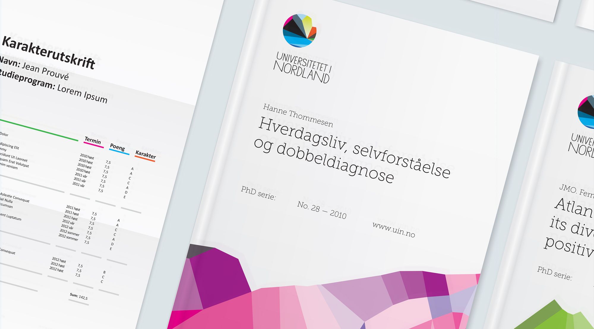
The combination of these qualities is what gives UiN its distinctive character. The symbol tells a story about how the sea and nature are inextricably linked together. This combination is at the core of this northern county, and in an academic perspective the symbol represents the location of the university and the various fields of study and disciplines build on this premise. UiN used Rayon for developing concept, brand strategy, visual identity, digital platform, editorial design and recruitment campaigns as well as exposures at education fairs.